
Slow-loading images push visitors away before your page even appears. Studies from Google show that as page load time goes from one second to three seconds, the chance of bounce jumps by 32 percent. On most websites, images are the heaviest part of the page, which means image optimization is often the biggest single fix you can make.
Optimizing images for faster website loading takes a mix of smart format choices, compression, sizing, and delivery tricks. The good news is that every step in this guide is beginner-friendly, free to start, and works on any platform.
In this guide, you’ll learn:
- How to pick the right image format for each use case
- How to compress images without losing visible quality
- How to resize, lazy-load, and serve responsive images
- The best free tools to speed up your workflow
- How to test results and avoid common mistakes
By the end, you’ll know exactly how to shrink image weight, keep visuals sharp, and help every page load fast on any device.
Key Takeaways
- Use modern formats like WebP or AVIF to cut image size by 25 to 50 percent
- Compress every image before uploading using free tools such as TinyPNG or Squoosh
- Resize images to match the display size; never upload a 4000-pixel photo for a 600-pixel slot
- Add lazy loading by using the loading=’lazy’ attribute on your img tags
- Serve images through a CDN to deliver them from servers near each visitor
- Test results with Google PageSpeed Insights and aim for a Largest Contentful Paint below 2.5 seconds
Quick Answer:
To optimize images for faster website loading, save them in modern formats like WebP or AVIF, compress them with tools such as TinyPNG or Squoosh, resize them to match their display size, add the loading=’lazy’ attribute, use srcset for responsive sizing, and serve them through a CDN. Together, these steps can shrink page weight by 60 percent or more.
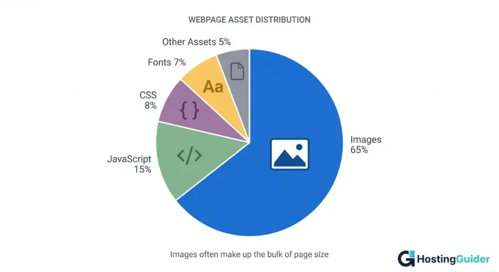
Why Image Optimization Matters for Page Speed
Images are usually the largest assets on a webpage. According to the HTTP Archive Web Almanac, images make up the largest share of total page weight on most sites, often more than scripts, fonts, and CSS combined. If you skip optimization, even a single hero photo can add several megabytes to your load time.
Faster pages help in three real ways:
- Better user experience because visitors stay longer when pages load fast.
- Higher SEO rankings because Google uses Core Web Vitals, including Largest Contentful Paint (LCP), as ranking signals.
- More conversions because public studies from companies like Akamai and Walmart suggest a one-second delay can reduce conversion rates noticeably.
Speed is no longer a nice extra. It is the baseline that visitors and search engines expect.
Choose the Right Image Format
Picking the correct format is the first big decision. Each format has a job, and the wrong choice can double your file size for no reason.
JPEG (or .jpg)
JPEG (or .jpg) is best for photos and complex images with many colors. Uses lossy compression, which throws away small details to shrink file size. A solid pick for product photos, blog headers, and team images.
PNG
PNG is Best for graphics, logos, and screenshots that need transparency or sharp edges. Uses lossless compression, so file sizes stay larger than JPEG. Avoid PNG for full-color photos.
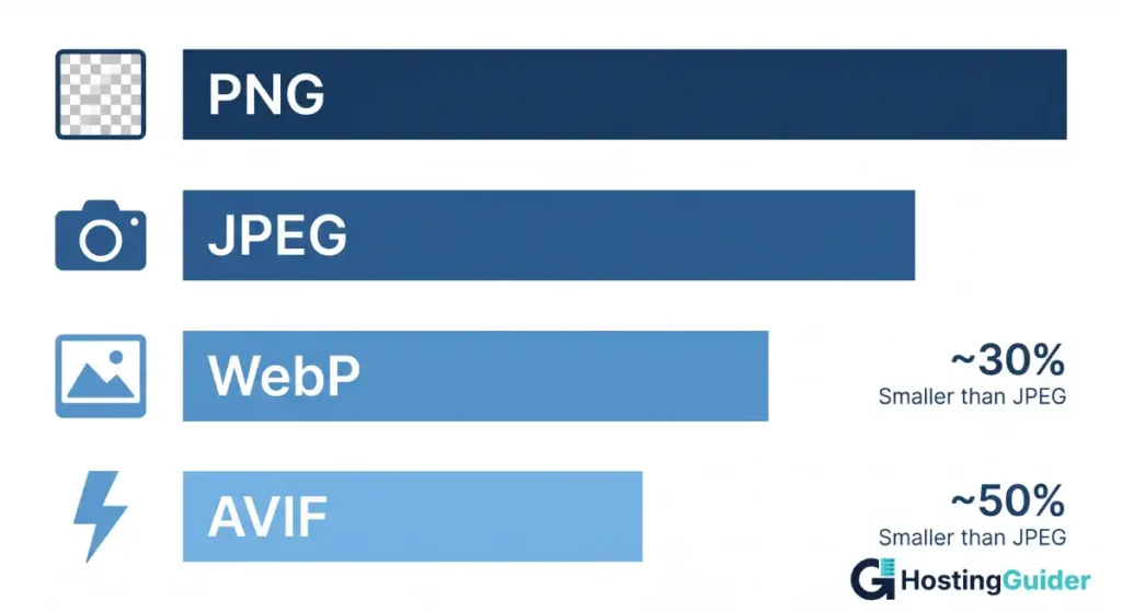
WebP
WebP is a modern format from Google. WebP files are about 25 to 35 percent smaller than JPEG at similar quality. Every major browser supports WebP, including Chrome, Firefox, Safari, and Edge.
AVIF
AVIF is newer than WebP and even smaller, often around 50 percent lighter than JPEG. Browser support is now strong in Chrome, Firefox, and Safari. Use AVIF as your top choice for hero images on modern sites.
SVG
SVG is best for logos, icons, and simple shapes. SVGs are vector files, so they stay sharp at any size and usually weigh just a few kilobytes.
Quick rule of thumb:
- Photos: AVIF or WebP, with JPEG fallback
- Logos and icons: SVG
- Screenshots: PNG or WebP
- Animated images: WebP instead of GIF, since WebP files are far smaller
Compress Every Image Before Upload
Compression removes data your eyes cannot see, but the file ends up much smaller. There are two types:
- Lossy compression for bigger savings with a slight quality drop, ideal for photos.
- Lossless compression keeps every pixel and gives smaller savings, best for logos and graphics.
How to compress an image step by step:
- Open your image in a free tool like Squoosh, TinyPNG, or ShortPixel.
- Choose a quality setting between 70 and 85 percent for photos.
- Preview the result side by side. If the image looks fine, save it.
- Upload the smaller file to your site.
Real example: A 3 MB iPhone photo compressed in Squoosh at 80 percent quality usually drops to around 350 KB. That is roughly 88 percent smaller, with no visible quality loss for most viewers.
If you run a WordPress site, plugins like Smush, ShortPixel, or Imagify can compress every image in your media library automatically.
Resize Images to the Correct Dimensions
Uploading a 4000-pixel-wide photo for a 600-pixel slot is one of the most common speed killers. The browser must download the full file, then shrink it visually on screen. That wastes bandwidth and slows down loading.
Steps to resize:
- Check the maximum display width on your site (often 1200 to 1600 pixels for full-width banners, 600 to 800 for inline content).
- Open the image in any editor such as Photoshop, GIMP, Canva, or Preview on Mac.
- Resize the longest edge to match that width.
- Save and compress.
Example: Your blog content area is 720 pixels wide. Resize all post images to about 1440 pixels (twice the display size, so they look sharp on retina screens) before uploading. Anything larger is wasted weight.
Serve Responsive Images with srcset
Responsive images let the browser pick the right size for each device. A phone gets a small file. A desktop gets the larger one. The result is faster loads on mobile without losing sharpness on big screens.
Use the srcset and sizes attributes inside your img tag:
html
<img src='photo-800.jpg'
     srcset='photo-400.jpg 400w, photo-800.jpg 800w, photo-1600.jpg 1600w'
     sizes='(max-width: 600px) 400px, (max-width: 1200px) 800px, 1600px'
     alt='Sunrise over a mountain lake'>
The browser reads the sizes attribute, picks the closest match from srcset, and downloads only that file. According to MDN Web Docs, this method can sharply cut mobile data usage on image-heavy pages.
If you use WordPress, Shopify, or most modern site builders, srcset is added automatically when you upload images at a high enough resolution.
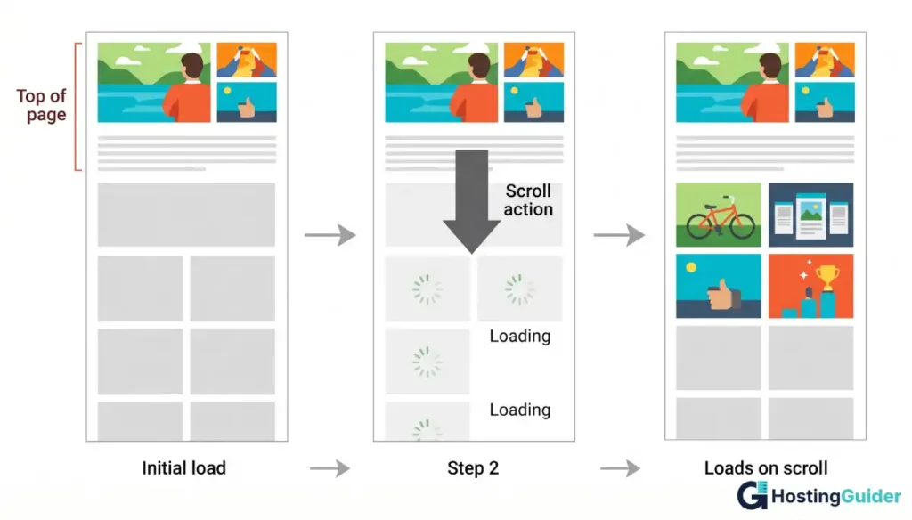
Add Lazy Loading
Lazy loading means images load only when they are about to scroll into view. Pages with many images, like product grids or long blog posts, load faster because the browser does less work upfront.
The simplest way to add it:
html
<img src='example.jpg' alt='Blue running shoe side view' loading='lazy'>That single attribute is supported in every major browser and needs no JavaScript. Skip lazy loading for your hero or above-the-fold image, since browsers may delay it and hurt your LCP score.
Use a Content Delivery Network (CDN)
A CDN stores copies of your images on servers around the world. When a visitor in London loads your site, the images come from a London server, not from your main host. This can cut load times by hundreds of milliseconds.
Popular options include:
- Cloudflare has a strong free plan
- Bunny.net for low cost and fast delivery
- Cloudinary with advanced image features and a free tier
- Amazon CloudFront for AWS users
Many CDNs also auto-convert images to WebP or AVIF and resize them on the fly, which saves you manual work on every upload.
Optimize Images for SEO
Speed is half the story. Search engines also read your image files. Two SEO basics matter most.
Use descriptive file names
Bad: IMG_4827.jpg
Good: blue-running-shoes-side-view.jpg
Search engines and screen readers use the file name as a hint about the image content. Hyphens between words are easier to read than underscores.
Write helpful alt text
Alt text describes the image for visually impaired users and helps Google understand the visual.
Bad: photo of shoes.
Good: Blue Nike Pegasus 41 running shoe, side view on white background
Avoid keyword stuffing. Write alt text that a real person would find useful if the image failed to load.
Test Your Image Optimization
Always measure before and after. Free tools to use:
- Google PageSpeed Insights shows LCP, total page weight, and image-specific savings.
- WebPageTest gives a detailed waterfall showing each image load time.
- GTmetrix provides visual scoring with image audit reports.
- Chrome DevTools lets you open the Network tab, filter by Img, and check sizes.
Run a test, fix the flagged issues, then test again. Aim for an LCP under 2.5 seconds, the target Google sets in its Core Web Vitals guidelines.
Best Tools for Image Optimization
Free tools:
- Squoosh by Google works in the browser with no signup needed
- TinyPNG and TinyJPG offer drag-and-drop compression
- ImageOptim is a Mac app for lossless compression
- GIMP gives full editing power similar to Photoshop
Paid or freemium tools:
- ShortPixel works very well with WordPress
- Cloudinary offers a CDN plus auto-optimization
- Imagify is an easy WordPress plugin from the WP Rocket team
Pick one tool for compression and stick with it. Mixing tools across the same site can give inconsistent quality.
You can also use a free online image compressor or page speed checker to spot-check single images before upload.
Common Image Optimization Mistakes
- Uploading raw photos straight from your camera or phone
- Using PNG for full-color photos when JPEG or WebP would work
- Skipping alt text and helpful file names
- Lazy loading hero or above-the-fold images
- Forgetting to clear your CDN cache after replacing images
- Compressing first, then resizing later (always resize first)
Each mistake adds extra weight or hurts user experience. Fixing them gives you fast, consistent results across every page.
FAQs
How much should I compress images for a website?
Compress photos to 70 to 85 percent quality. Aim for files under 200 KB for inline blog images, under 500 KB for full-width banners, and under 50 KB for thumbnails or icons. Always compare the compressed image to the original before saving to confirm there is no visible quality loss.
Is WebP better than JPEG for SEO?
Yes. WebP files are roughly 25 to 35 percent smaller than JPEG at similar quality, which means faster page loads and stronger Core Web Vitals. Faster pages help SEO. Every modern browser supports WebP, so you can safely use it across your entire site.
Does lazy loading hurt SEO?
No. Google supports the native loading=’lazy’ attribute and still indexes lazy-loaded images. The only rule is to avoid lazy-loading hero or above-the-fold images, since that can delay your Largest Contentful Paint and lower your Core Web Vitals score.
What is the best image size for a website?
Most websites display images at 800 to 1600 pixels wide. Save images at twice the display width so they look sharp on retina screens, then compress. For blog posts, 1200 pixels wide is a safe default. For full-width hero banners, 1920 pixels wide works well on most desktop layouts.
How do I optimize images on WordPress?
Install a plugin like Smush, ShortPixel, or Imagify. Choose WebP as the output format, set quality to 80 percent, and turn on lazy loading. The plugin will compress new uploads automatically and can also bulk-optimize your existing media library in the background.
How can I check if my images are optimized?
Run your page through Google PageSpeed Insights. The tool flags oversized, uncompressed, or wrong-format images and shows exact savings in kilobytes. You can also open Chrome DevTools, go to the Network tab, and filter by Img to see each image’s size and load time.
Which image format loads fastest on a website?
AVIF loads fastest among supported formats. AVIF files are typically about 50 percent smaller than JPEG at the same quality. WebP is a close second with wider browser support. A solid setup is AVIF first, with WebP and JPEG as fallbacks for older browsers.
Conclusion
Image optimization is the fastest way to make a website feel quick and modern. Pick the right format, compress every file, resize before uploading, add lazy loading, and serve through a CDN. Test with Google PageSpeed Insights, fix what it flags, and your load times will drop without touching the rest of your code.
Start with one page. Measure it, apply these steps, then move through the rest of your site. Each fix takes only a few minutes, and the results compound across every visitor, every device, and every search ranking.