
Hosting reviews are full of charts.
Average response time: 312ms. GTmetrix score: A. Uptime: 99.99%. Pingdom load time: 1.4 seconds.
These numbers look authoritative. Most of them are not.
The hosting industry runs on affiliate commissions. The same provider can rank first in one publication and last in another. Both publications show charts. Both claim independent testing. Both cannot be right.
This guide breaks down exactly how hosting benchmarks are manipulated, which metrics actually matter, and how to evaluate any benchmark report critically. By the end, you will be able to look at any hosting comparison and spot the manipulation in under sixty seconds.
Key Takeaways
- Most published hosting benchmarks are not designed to be accurate. They are designed to influence purchase decisions
- The single biggest manipulation technique is choosing the testing window and sample size that favours the desired outcome
- Average response time is the most commonly cited metric and one of the least useful
- Median and 95th percentile values reveal what averages hide
- Geographic location of the test changes everything, especially for global audiences
- A credible benchmark discloses its full methodology before showing any numbers
- You can run a more honest benchmark yourself in fifteen minutes using free tools
Why Hosting Benchmarks Are So Often Misleading
The economics drive the dishonesty.
Hosting providers pay affiliate commissions of $50 to $200 per signup. A blog that ranks Provider A first in its benchmark report earns those commissions. A blog that ranks Provider B first earns Provider B’s commissions instead.
This creates a powerful incentive to produce benchmarks that justify the ranking the publisher already wants. The methodology gets shaped to produce the desired outcome rather than to measure reality.
This is not about lying. It is about selection. Choose the right test conditions, the right time window, the right tools, and the right metrics, and any provider can be made to look like the fastest.
The good news is that the manipulation techniques are limited. Once you recognise them, you cannot un-see them.
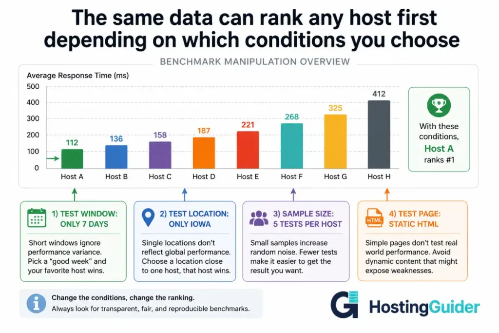
The Twelve Most Common Benchmark Manipulation Techniques
1. The Cherry-Picked Time Window
A 7-day benchmark and a 90-day benchmark on the same hosts often produce completely different rankings.
A provider that experiences one major incident per quarter looks great in a 7-day window that avoids that incident. The same provider looks unreliable in a 90-day window that catches it.
Reviewers who test for one week and publish the result are not lying. They are showing a real but unrepresentative slice of data.
What to look for:
- Total test duration disclosed clearly
- Tests covering at least 30 days, preferably 90
- Tests that include peak traffic periods, not just off-hours
What is a red flag:
- Phrases like during our testing without dates
- Tests conducted in a single week
- No mention of how long the data covers
2. The Sample Size Problem
Running a test 5 times and running it 5,000 times produce different statistical confidence.
Five tests can be cherry-picked. Five thousand tests cannot.
Many published benchmarks rely on tools that ping a site every 5 or 10 minutes. Over 24 hours, that produces 144 to 288 data points. That is barely enough to show a daily pattern.
A serious benchmark uses synthetic monitoring every 60 seconds from multiple locations over months. That produces hundreds of thousands of data points and reveals patterns that hourly testing misses entirely.
| Test Frequency | Data Points Over 30 Days | Reliability |
|---|---|---|
| Every 5 minutes | 8,640 | Low. Misses sub-minute patterns |
| Every 1 minute | 43,200 | Moderate. Misses sub-minute issues |
| Continuous synthetic | 100,000+ | High. Patterns visible at any timescale |
| Real user monitoring | Millions | Highest. Captures actual user experience |
3. The Geographic Bias
The same hosting account performs completely differently depending on where the test originates.
A test run from Iowa to a US-East server shows excellent results. The same test from Mumbai to the same server shows mediocre results. Both are true. Neither is the whole picture.
Hosting reviews that test from one location only are providing partial information. The result is technically accurate but practically misleading for any reader whose audience is not in that exact location.
A credible benchmark tests from at least four geographic regions:
- North America (East and West)
- Europe (Western)
- Asia Pacific
- South America or Middle East
For sites with global audiences, the worst regional performance often matters more than the average across all regions.
4. The Fresh Server Trick
Performance on a fresh server with one site loaded is dramatically better than performance on the same server six months later with real production traffic.
Some benchmarks set up a fresh test account, install a simple WordPress site, run their tests, and publish the results. This measures the theoretical maximum performance of that server type, not the realistic experience of a customer.
A real customer’s site has:
- Plugins generating database queries
- Months of accumulated content and revisions
- Real traffic competing for resources
- Other customers on the same shared infrastructure consuming resources
Lab conditions do not reflect production conditions. Always check whether the benchmark used realistic site conditions or a clean test environment.
5. The Static Page Test
A static HTML page with no images loads in 50 milliseconds on almost any host. That number tells you nothing about how your actual website will perform.
A real WordPress site involves PHP execution, database queries, plugin overhead, image loading, third-party scripts, and rendering. The bottleneck is rarely the server’s raw response time.
Benchmarks that test against minimal HTML pages are measuring network latency, not server performance under realistic load.
A credible test uses:
- A standard WordPress install with common plugins
- A realistic theme like Astra, GeneratePress, or a popular default theme
- Real content of at least 50 posts
- Standard images, not optimised-to-perfection ones
6. The TTFB vs Full Page Load Trick
Time to First Byte (TTFB) and full page load time measure completely different things. Reviewers sometimes use them interchangeably, which produces misleading rankings.
TTFB measures how long the server takes to start sending data. It depends on server processing, database queries, and network distance.
Full page load measures how long the entire page takes to render. It depends on TTFB plus asset sizes, CDN delivery, browser rendering, and external scripts.
A host with excellent TTFB can have poor full page load if its CDN is weak. A host with mediocre TTFB can have excellent full page load if its asset delivery is strong.
A trustworthy benchmark reports both, separately, with the methodology for each clearly explained.
7. The Cache Confusion
Modern hosts use multiple cache layers. The same request can return wildly different times depending on whether it hits the cache.
A cached page is served from memory in under 100ms. The exact same page generated fresh from the database might take 800ms.
Benchmarks that do not specify whether they are measuring cached or uncached responses are producing meaningless numbers.
Server-level caching dramatically changes the performance picture and most modern benchmarks should distinguish cached from uncached behaviour explicitly.
A credible benchmark reports:
- Cached page response time
- Uncached page response time
- Cache hit rate over the test period
- Whether testing forced cache bypass or measured normal traffic patterns
8. The CDN Question
A site behind a CDN performs very differently from a site without one. The CDN serves static assets from the nearest edge location. The host serves only dynamic content.
Some benchmarks include CDN performance in the result. Others exclude it. The same host can appear faster or slower depending on which choice the reviewer made.
If a host includes a CDN in their default setup, the benchmark should test with that CDN active. Excluding the CDN measures the host’s raw server but does not reflect what a customer actually experiences.
9. The Tool Choice Bias
Different testing tools produce different numbers for the exact same site.
GTmetrix uses a Canadian server and Lighthouse internals. Pingdom uses different test locations and a different rendering engine. WebPageTest uses real browsers and configurable test profiles. Google PageSpeed Insights uses Lighthouse plus real-world Chrome User Experience data.
| Tool | What It Measures | What It Misses |
|---|---|---|
| GTmetrix | Lighthouse score, page load, TTFB | Real user experience, geographic variance |
| Pingdom Tools | Page load from chosen location | Comprehensive Lighthouse metrics |
| WebPageTest | Real browser performance, multiple locations | Real user data (synthetic only) |
| PageSpeed Insights | Lab and real user data combined | Single page, single location lab test |
| KeyCDN Tools | Multi-region TTFB, server response | Full page render performance |
A benchmark using only one tool is showing one perspective. A benchmark using several tools and showing the variance is showing the true picture.
10. The Plan Mismatch
Comparing the entry plan of Host A to the premium plan of Host B is not a fair comparison. Reviewers sometimes do this without highlighting the price difference clearly.
A $4 per month shared plan should not be compared against a $40 per month managed WordPress plan. They serve different markets and use different infrastructure.
The most honest comparisons:
- Match price tiers across providers
- Match resource allocations (CPU, RAM, storage) where possible
- Clearly note when plans being compared are not equivalent
11. The Statistical Manipulation
Average response time hides the actual performance picture.
Consider these two hosts:
Host A: Responds in 200ms for 99% of requests. Responds in 4000ms for 1% of requests. Average: 238ms.
Host B: Responds in 230ms for all requests, consistently. Average: 230ms.
Host B has a lower average and looks better. But Host A serves 99% of users faster than Host B. The averages mislead you about which host most visitors will prefer.
The metrics that reveal the truth:
- Median (50th percentile): The middle value
- 95th percentile (p95): The value that 95% of requests fall under
- 99th percentile (p99): The value that 99% of requests fall under
- Standard deviation: How spread out the values are
A serious performance report includes all of these. A misleading one shows only the average.
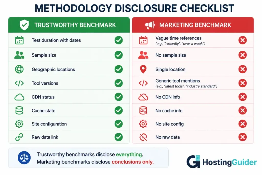
12. The Disclosure Gap
The most reliable signal of a credible benchmark is methodology disclosure.
Reports that explain everything tend to be honest. Reports that show only conclusions and pretty charts often hide the choices that produced those conclusions.
Look for:
- Total test duration with start and end dates
- Number of sample points
- Geographic test locations listed by name
- Testing tool versions and configurations
- Whether CDN was active
- Whether cache was warmed or cold
- Site setup including theme and plugins
- Raw data availability for independent verification
If any of these are missing, the benchmark should be treated as marketing material, not data.
The full methodology behind any provider ranking should be public and verifiable. Without that disclosure, even technically accurate numbers can produce misleading conclusions.
The Metrics That Actually Matter
Most published benchmarks emphasise the wrong metrics. Here are the ones that actually predict the experience your visitors will have.
Time to First Byte (TTFB)
TTFB is the gap between a visitor’s browser sending a request and the first byte of response arriving back. It is the cleanest measure of server-side performance because it isolates the server from network and rendering effects.
Good TTFB benchmarks:
- Under 200ms is excellent
- 200-500ms is good
- 500-800ms is acceptable
- Above 800ms indicates a real performance problem
Test TTFB independently using:
curl -o /dev/null -s -w "TTFB: %{time_starttransfer}s\n" https://yourdomain.com
This gives you a single TTFB measurement from your current location. Run it from different geographic locations using a VPN to see variance.
Largest Contentful Paint (LCP)
LCP measures how long until the largest visible element renders on the page. Google uses LCP as a Core Web Vitals ranking factor.
A site with LCP under 2.5 seconds is considered good. Above 4 seconds is poor. The host affects LCP through TTFB and asset delivery speed.
First Contentful Paint (FCP)
FCP measures how long until the first text or image appears. This is the metric that determines whether a visitor thinks the page is loading or broken.
Under 1.8 seconds is good. Above 3 seconds is a problem.
Server Response Under Concurrent Load
Single-user tests are not enough. The real test is how a server responds when 50, 100, or 500 users hit it simultaneously.
Most published benchmarks do not test concurrent load. A host that responds in 200ms with one user might respond in 4 seconds with 50 simultaneous users. That difference matters more than the single-user number.
Tools that measure concurrent load:
- k6 (open source load testing)
- Apache Bench (basic but available everywhere)
- Loader.io (cloud-based)
- LoadView (paid commercial tool)
Apache Bench example for testing how a host handles 100 simultaneous users sending 1000 total requests:
ab -n 1000 -c 100 https://yourdomain.com/
The output shows requests per second, mean response time, and the distribution of response times across percentiles. The p95 and p99 values are where the real performance picture emerges.
Uptime Percentage Plus Outage Distribution
Uptime is the metric every hosting marketing page emphasises. It is also one of the most easily manipulated.
The math behind common uptime claims:
| Uptime Percentage | Annual Downtime Allowed | Monthly Downtime Allowed |
|---|---|---|
| 99% | 87 hours 39 minutes | 7 hours 18 minutes |
| 99.9% | 8 hours 45 minutes | 43 minutes |
| 99.95% | 4 hours 22 minutes | 21 minutes |
| 99.99% | 52 minutes 35 seconds | 4 minutes 22 seconds |
| 99.999% | 5 minutes 15 seconds | 26 seconds |
Even 99.9% uptime allows almost 9 hours of downtime per year. That is real time your visitors cannot reach you.
But uptime percentage alone hides the distribution. A host with one 8-hour outage and otherwise perfect uptime shows the same percentage as a host with 96 five-minute outages spread across a year. The first outage pattern is catastrophic. The second is barely noticeable.
A credible report shows both:
- Total uptime percentage over the test period
- Number of distinct outages
- Average and longest outage duration
- Distribution of when outages occurred (peak hours vs off-hours)
Response Time Stability
Response time stability matters more than average response time for most use cases.
A host that consistently responds in 280ms is more useful than one that averages 250ms but ranges from 100ms to 800ms unpredictably.
Stability is measured by standard deviation. A low standard deviation means consistent performance. A high standard deviation means unpredictable user experience.
| Stability Metric | What It Tells You |
|---|---|
| Standard deviation under 50ms | Highly consistent performance |
| Standard deviation 50-150ms | Acceptable variance |
| Standard deviation 150-300ms | Visible to users at the high end |
| Standard deviation over 300ms | Significant user experience issues |
The Statistical Toolkit Every Reader Should Have
You do not need to be a statistician. You do need to understand four concepts.
Mean vs Median
Mean is the average. Add all values and divide by count.
Median is the middle value. Half the values are higher. Half are lower.
When data is symmetrically distributed, mean and median are similar. When data has outliers, they diverge significantly.
Hosting response time data almost always has outliers. The mean gets pulled higher by occasional slow responses. The median tells you what most users actually experience.
If a benchmark reports only the mean, treat its conclusions with caution. If it reports both mean and median, and they are close, the data is probably reliable. If they diverge significantly, the data has outliers worth investigating.
Percentiles (p50, p95, p99)
Percentiles describe the distribution of values.
p50 is the median (50th percentile). Half of all requests are faster than this value.
p95 is the value that 95% of requests are faster than. The slowest 5% are above this number.
p99 is the value that 99% of requests are faster than. The slowest 1% are above this number.
For most websites, p95 is the most important metric. It captures the experience of nearly every visitor while ignoring extreme outliers that may not be representative.
For ecommerce and high-traffic sites, p99 matters because the slowest 1% of page loads still represent hundreds or thousands of users daily.
Standard Deviation
Standard deviation measures how spread out values are around the average.
A low standard deviation means most values cluster close to the average. High standard deviation means values are scattered widely.
For hosting performance, a low standard deviation means predictable, consistent service. A high standard deviation means unpredictable service that randomly delivers fast and slow responses.
Confidence Intervals
A confidence interval expresses how certain you can be about an estimate.
If a benchmark says response time is 250ms with a 95% confidence interval of plus or minus 30ms, that means we can be 95% confident the true average is somewhere between 220ms and 280ms.
Benchmarks that show a single number without any confidence range are oversimplifying. Two hosts measured as 250ms might be statistically indistinguishable when measurement error is accounted for.
How to Run Your Own Honest Benchmark
You can produce more reliable data than most published benchmarks using free tools and fifteen minutes.
Step 1. Pick Your Test Targets
Choose at least three hosts. Include the host you are considering buying. Include one provider known for performance like Kinsta or Rocket.net as a benchmark reference. Include one cheap provider as a baseline.
Step 2. Use Identical Test Sites
Create or find test sites on each host using:
- The same theme (Astra free version is widely used)
- The same plugins (a baseline like Yoast, Contact Form 7, an SEO plugin)
- The same content (clone the same WordPress export to each)
- The same images
Without identical sites, you are testing site differences, not host differences.
Step 3. Test from Multiple Locations
Use a free tool that supports multi-region testing. KeyCDN Tools tests TTFB from 14 global locations simultaneously.
Run the test five times per location with a one-minute gap between runs.
Step 4. Test at Different Times of Day
Run tests during:
- Peak hours for your target audience timezone
- Off-peak hours overnight
- Weekend traffic patterns
Different hosts perform differently under different load conditions on their underlying infrastructure.
Step 5. Test Both Cached and Uncached
Force cache bypass for some tests using a unique query parameter:
https://yourdomain.com/?nocache=1
https://yourdomain.com/?nocache=2
https://yourdomain.com/?nocache=3
Run the test five times forcing fresh cache state. Then run five times normally. Compare both numbers.
Step 6. Record Real Data, Not Conclusions
Save raw data from every test. A spreadsheet with date, time, location, tool used, and exact result.
Calculate mean, median, p95, and standard deviation for each host. Compare those numbers, not single test results.
Step 7. Test Long Enough to Capture Real Patterns
Run continuous tests for at least 30 days before drawing conclusions. Set up free synthetic monitoring at UptimeRobot or similar and let it accumulate data.
A single afternoon of testing tells you very little. A month of continuous monitoring tells you everything.
Red Flags That Should Make You Skeptical
When reading any hosting benchmark report, treat these signals as warnings:
- Test duration not specified or only vaguely mentioned
- Single geographic test location
- No mention of sample size or how many measurements were taken
- Only average response time reported, no median or percentiles
- No raw data available for independent verification
- No mention of whether the site was cached or uncached
- Promotional language describing the testing process
- Top-ranked provider also has the largest affiliate commission rate
- Conclusions presented before methodology
- No standard deviation or confidence interval mentioned
- Static test page used instead of realistic WordPress site
- Comparing different price tiers without highlighting the difference
A benchmark exhibiting three or more of these signals should not be trusted to inform a purchase decision.
Green Flags That Signal Credible Methodology
These signs indicate a benchmark report is worth taking seriously:
- Test duration of 30 days or longer with specific dates
- Multiple geographic test locations across at least three continents
- Sample size of 10,000 or more measurements per host
- Mean, median, and percentiles all reported
- Raw data available for download
- Cache state clearly explained
- Identical test sites described in detail
- Standard deviation reported
- Methodology section published before results
- Independent verification by a third party
- Source code or test scripts open-sourced
A benchmark exhibiting most of these signals deserves your attention. The conclusions might still not match your specific needs, but the data is at least honest.
Real Example: How to Read a Typical Benchmark Report
Consider this excerpt from a typical hosting review:
Provider A consistently delivered the fastest response times in our testing. Average page load was 1.2 seconds compared to 1.8 seconds for Provider B and 2.1 seconds for Provider C. We highly recommend Provider A for serious WordPress users.
Apply the framework to this excerpt.
What is disclosed:
- Three providers compared
- A single metric (page load time)
- A conclusion (Provider A is fastest)
What is not disclosed:
- Test duration
- Number of samples
- Geographic location
- Whether tests were cached
- What site configuration was used
- Whether CDN was active
- Median or percentile values
- Standard deviation
- Test conditions (concurrent load or single user)
This excerpt provides no information you can act on. It is a conclusion without evidence. The 600ms difference between Provider A and Provider B might be a real performance gap, or it might be within test variance and effectively identical.
Compare that to a methodology-disclosed version:
Tests were conducted continuously from March 1 to May 31 using Lighthouse 11.4 from four locations (Virginia, London, Singapore, Sydney). Each provider was tested against an identical Astra-themed WordPress site with 50 sample posts, Yoast SEO, and WP Forms installed. Tests were run with both cold and warm cache states. Each provider received 43,200 samples per location across the test period. CDN was active on hosts that include it by default and disabled on those that do not.
Provider A: mean TTFB 187ms, median 175ms, p95 312ms, p99 580ms, standard deviation 48ms.
Provider B: mean TTFB 245ms, median 220ms, p95 480ms, p99 920ms, standard deviation 110ms.
Raw data available at github.com/example/hosting-benchmark-raw-data.
That version gives you everything needed to evaluate the comparison yourself. The conclusions are supported by data you can verify.
For our own approach to provider evaluation, the same principles apply. Disclosure first, conclusions second. Raw data wherever possible. Multiple metrics rather than averages alone.
What Real-World Performance Actually Looks Like
To set realistic expectations, here is what credible long-term testing typically shows for different hosting tiers.
| Hosting Tier | Median TTFB | p95 TTFB | Uptime |
|---|---|---|---|
| Shared (under $5/month) | 600-1200ms | 1500-3500ms | 99.85-99.95% |
| Shared (premium, $10-15/month) | 350-700ms | 800-1500ms | 99.95-99.99% |
| Managed WordPress (entry) | 250-450ms | 500-900ms | 99.95-99.99% |
| Managed WordPress (premium) | 100-250ms | 250-500ms | 99.99-99.995% |
| Cloud edge (Cloudflare Enterprise) | 50-180ms | 150-350ms | 99.99-99.999% |
| Self-managed VPS (good config) | 150-400ms | 400-900ms | Depends on you |
These ranges reflect what consistent, multi-region, long-duration testing produces. Single-test results can fall outside these ranges in either direction without meaning anything.
A premium managed host like Kinsta typically lands in the 150-300ms median TTFB range globally. Rocket.net on Cloudflare Enterprise often delivers under 100ms median TTFB. SiteGround on their cloud plans consistently performs in the 200-400ms median range.
A budget shared host advertising 250ms response times is either testing under unrealistic conditions or describing a peak rather than typical performance.
Frequently Asked Questions
What is the most important metric in a hosting benchmark?
For most websites, median TTFB combined with 95th percentile TTFB gives you the clearest picture of real-world server performance. Median tells you what typical users experience. The 95th percentile tells you what the slowest 5% of users experience. A host with low values for both is genuinely fast. A host with a low median but high 95th percentile is fast most of the time but unpredictable. For ecommerce and revenue-critical sites, also pay attention to standard deviation, which indicates consistency over time.
Why do GTmetrix and Pingdom show different scores for the same site?
The two tools use different measurement approaches, different test locations, and different scoring algorithms. GTmetrix uses Lighthouse internals and tests from Canada by default. Pingdom uses its own engine and offers a choice of test locations including US East, Europe, and Asia. Pingdom tends to emphasise overall page load time. GTmetrix emphasises Lighthouse scoring criteria. Neither is wrong. They are measuring different things from different starting points. For a complete picture, run tests in both and compare.
How long should a hosting benchmark run before the results are reliable?
A statistically meaningful benchmark needs to run for at least 30 days with continuous synthetic monitoring at intervals of one to five minutes. This duration captures daily traffic patterns, weekly patterns, and at least one maintenance or incident cycle. Tests under 7 days produce data that is too narrow to be reliable. Tests of 90 days or longer are even better because they capture monthly billing cycle effects and seasonal patterns on shared infrastructure.
Does the time of day affect hosting benchmark results?
Yes, significantly. Shared hosting performance varies based on what other customers on the server are doing. A test run at 3am when most sites are quiet shows different results than a test run at 9pm when traffic peaks across multiple sites on the same machine. A credible benchmark distributes tests across all hours and weekdays versus weekends. Tests that only run during one time window are missing essential performance variation data.
Should I trust uptime numbers published by hosting providers?
With caution. Provider-published uptime numbers typically exclude scheduled maintenance windows and certain types of incidents under their terms of service. They also typically measure availability of their network, which is not the same as the availability of your specific site on their infrastructure. Independent monitoring through tools like UptimeRobot or Statuscake produces uptime data that reflects your actual user experience. Always verify provider claims against independent monitoring data when uptime matters for your decision.
What does standard deviation tell me about a hosting provider?
Standard deviation measures how spread out the response time values are. A low standard deviation (under 50ms) means the provider delivers consistent performance request after request. A high standard deviation (over 200ms) means performance is unpredictable, with some requests fast and others slow. For user experience, consistent performance often matters more than peak performance. A host that always responds in 280ms feels more reliable than one that averages 250ms but ranges from 100ms to 700ms unpredictably. Standard deviation reveals this stability dimension that averages cannot.
Can I run my own hosting benchmark without technical skills?
Yes. Free tools like KeyCDN Performance Test, GTmetrix, Pingdom Tools, and PageSpeed Insights let you run individual tests in seconds with no technical setup. For continuous monitoring, UptimeRobot provides 50 monitors free with 5-minute checks. The skill is not in running the tests but in interpreting the results correctly. Apply the framework in this guide: check sample size, test from multiple locations, compare median and percentiles, and run tests over weeks rather than minutes. The tools handle the measurement. You handle the methodology.